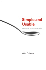
 I finally got round to writing a review of Simple and Usable, or to give it the full title: Simple and Usable Web, Mobile and Interactive Design by Giles Colborne.
A little bit of full disclosure first: the author used one of my photos in the book, which is how I got to hear about it in the first place.  That doesn’t give me any financial interest though. The photo is Creative Commons. I guess I am a little well-disposed towards Giles for having the courtesy to tell me he was using the picture, which is not necessary. He also sent me a copy of the finished book which is also not necessary but appreciated.
As it happens I thought it was a particularly poor picture of mine that he wanted to use (page 135 since you ask) which made me expect a dreadful, tatty book. It turns out that the picture actually looks OK when printed in good quality. The author obviously has a better eye for visuals than I do, which is why he is writing the books on design and I am just reading them.
Here is the full review from Amazon:
As you would expect from a book that preaches simplicity and usability in design, this is a very attractive book: well laid-out, uncluttered and with no waffle.
As another reviewer has noted, this is not a text book full of densely-packed detail. I have seen one of them years ago. It was a book on human-computer interfaces that was about two inches thick, with tiny text and a few black and white diagrams and screenshots in it. Look up the word ‘daunting’ in a dictionary and there would probably just be a picture of that book.
This takes a different approach and is more like a manifesto than a text book. The most striking aspect of the book is the layout which has each double-page spread comprising a left-hand page of text and a right-hand page that is a full-page illustration. At first I thought this could mean a paucity of content, but soon realised that it works very well, keeping one idea per page makes it a lot easier to absorb what is there. I suspect this means a reader could easily retain more information from this book than from one with 10 times as many words but less attention to design.
I read the book in a couple of sittings, but it just as easily lends itself to dipping in and reading individual pages in isolation because they are largely self-contained, though also part of an overall structure, if that makes sense.
There are plenty of real-life examples to demonstrate the concepts in the box as well as a recurring example of a hypothetical DVD remote control to anchor each stage of the structure to something that is easy to identify with.
One real-life example is the Telewest PVR box (which has now become the Virgin Media V+ box). I have one of those so was able to easily confirm the wisdom of that particular page. A recurring example is the Flip video camera from Cisco which the author holds up as a supreme example of simplicity and usability. I have subsequently used one and found that it really is that easy, giving me even more confidence in the validity of the precepts of this book.
In fact, having now experienced the Flip, I think the best way to sum up this book is to say it is the written equivalent of the Flip – it knows what it wants to do, and doesn’t risk diluting that purpose by adding anything unnecesary for the sake of it. Yes it is a slim volume, but it is as long as it needs to be and would not be improved by adding lots of padding.
Had the book turned out to be rubbish I wouldn’t have written a bad review, I would have just not reviewed it, but I really enjoyed it. It made me consider design in a way I had not before. If only I had read it before designing this site eh?


No Comments so far ↓
Like the collective mind of the Daily Mail, comments are closed.