

After two years of work the Crawley Tories have come up with a design for a new Crawley Borough Council logo.
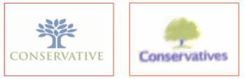
The predominance of blue in the logo comes as no surprise, but I wasn’t expecting a tree design. Very original. I wonder where they got the idea from… oh hang on…

Or even more spooky:
I wonder how much fuss there would have been if we had redesigned the council’s logo a few years back and gone for a red rose – to symbolise the town’s success in the South-East in Bloom competitions obviously?
Anyway, there is a lot being made of the new one costing £12,000. Actually that seems like a bargain compared to other corporate re-brandings. In fact it looks suspiciously cheap. But of course, even if it is only £12,000, that is just for the design and is not taking into account the costs of replacing the logo on vehicles, clothing, papers, literature, business cards and everything else.
The argument will be made that these things will all have to be replaced over time anyway and they will just replace stuff as usual but put the new logo on everything new but once such a process starts there will be enormous pressure to get everything consistent. Council wardens’ jackets will et replaced a year or two earlier than they would otherwise have been, staff wil conveniently lose piles of stationery so they can order replacements with the new logo.
I think the Tories may be secretly quite happy to take the flak for pissing away £12,000 on the new logo, because all the criticism will distract attention away from what it really cost.
And lets not forget the old logo was only a 3-colour one. The new one is 15-colour. With modern production techniques that should make no difference in cost, but we all know it will.
But having said that, the old logo was a bit tired, old-fashioned, uninspired and uninspiring. It was due for an overhaul. I just think it would have been a good idea to wait for a while, just to see if mutterings about local government re-organisation come to anything. Why spend a penny on a new Crawley Borough Council logo if you finally get everything properly branded and then find that you need to replace everything again with Crawley Unitary Authority, or something else?
One other criticism is that the logo is a bit fussy – not a clean, elegant design – and not only that but its not future-proof because it is trying to be too clever. The number and colour of the leaves is supposed to represent the neighbourhoods of Crawley, which are all colour-coded. If another neighbourhood gets built then the logo becomes out of date. It will be like the early American flag which they had to keep re-designing to add more stars when more states joined, or those 50p pieces with the ring of hands which had the wrong number of hands when Greece joined. (OK not until 13 years later – but a new neighbourhood in Crawley could come sooner than that)
What I can’t understand is why, if I look at the new logo, I keep thinking about the Partridge Family.

Dare I say it…I think the new logo is really good.
Its not intrinsically bad. Might be good for a TV company or nursery school for instance.
I think its too fussy, and doesn’t work well if it has to be reproduced in 2 colours, and looks unbalanced if it is reproduced in greyscale.
It’s fairly good. The old one wasn’t great anyway. But the issues are more about how the decisions were made (Tories want a new logo, set up a process which sits behind closed doors, decision made before people can ask questions about the costs) and whether the priority for the Council was to do this, or spend it’s time and our money on something else.
Besides, Richard, it signifies ‘growth’ among other things. Looks like the Tories have abandoned opposition to the idea of more houses being built as well…
Regarding your last comment about housing, Owen, methinks all the political parties (not just Tories) were (& are) being pulled in so many different directions – I think it has been Labour’s Ifield Councillor, John Mortimer, who has been the only one to keep his eye on the ball, and play with a straight bat.
Uncommon sense appears to have prevailed at HDC & CBC, under their Joint Area Action Plan (JAAP). They have wisely chosen the Bewbush/Browns Landfill site as their ‘preferred option’ for 2500 houses – not the ancient Parish of Ifield & its Golf Club et al.
This has to be confirmed at HDC next Tuesday, and CBC the following day – but I venture to suggest that HDC/CBC have managed to steady its very unsteady planning ship – no thanks to WSCC by the way !
Not just John. Several other councillors were also against transfer, although perhaps not as vocally.
Most were in favour of a ballot, if only to prove that there was no appetite for it, and to kill off the idea for some time to come. Even those who thought transfer was possibly the only course of action because of the finances were pretty unhappy about it, and now it seems that they were wrong. Perhaps misled by the consultants etc.